The Vara Brand.
Institutional marks & logotypes
The Vara logotype features geometric letterforms crowned by an upward arc over the final letterform, symbolising generational momentum and forward stewardship.
Use on light, neutral backgrounds (#f3f6f4, #ffffff). The deep teal color represents institutional gravity and patient capital.
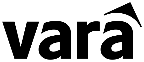
Used in the site footer, dark hero banners, and deep teal surfaces. Maintains maximum contrast and crisp legibility.

The V & Generational Arc Monogram
The standalone favicon mark combines the geometric V from the logotype crowned by the forward-looking directional arc in clean optical balance. Built in multi-resolution SVG, ICO, and Apple Touch Icon formats.

Calibrated palette
A cohesive system composed of mineral slates, institutional teals, warm terracotta earth tones, and stone celadons.
Primary Teal
--primary
Core institutional mark, primary buttons, structural identity anchors
Deep Slate Teal
--foreground
Headings, authoritative display typography, primary ink
Terracotta Earth
--accent
Warm focus cards, active indicators, section eyebrow anchors
Institutional Dark
--dark-surface
Hero background, footer baseline, dark architectural panels
Stone Celadon
--background
Standard canvas, crisp architectural whitespace
Pale Mist Teal
--secondary
Inset secondary panels, alternate grid cells, soft containers
Sandstone Rose
--perspectives-surface
Perspectives & testimonial surfaces, warm grounding accent
Chalk Teal Border
--border
1px hairline architectural grid divisions & frame borders
Dual typographic framework
Typography at Vara pairs the architectural clarity of Manrope for display headlines with the rigorous functional precision of IBM Plex Sans for long-form reading.
Manrope
Stewardship is measured over time.
IBM Plex Sans
Capital carries obligations that outlast any one decision-maker. The institution exists to steward those obligations with clarity, dignity, and care.
Brand standards & covenants
Architectural Precision
Strict 1px hairline borders (#d1dcda), 0.25rem micro-radii, and disciplined grid structures reflect order and institutional endurance.
Restraint Over Noise
Avoid neon gradients, aggressive floating widgets, or transient startup trends. Quiet authority is conveyed through generous whitespace and calibrated typography.
Dignity-First Representation
All imagery and narrative representation honours communities as participants and self-determining agents, never as passive beneficiaries.